top of page


Alif, Auckland
BRAND IDENTITY · PACKAGING · DIGITAL
Building a fast-food brand from the first letter forward to 40% growth in Sales
Alif began with an ambition larger than a logo: to create a recognisable food brand that could hold together across every place a customer encountered it.
From naming and identity to packaging, menus, digital and the physical space, we built a visual system designed to remain unmistakably Alif.


The Thinking
A second beginning, built to go further.
The founder had ventured into food before. This time, the ambition was bigger: build something recognisable, repeatable and ready to grow beyond a single restaurant.
That changed the question from “What should this restaurant look like?” to “What will make this brand recognisable wherever people meet it?”
Because a food brand is experienced in fragments — on a sign, across a menu, around a takeaway box or on a screen.
We built around a set of distinctive visual assets that could repeat across those moments and, over time, make Alif unmistakably Alif.
Different touchpoints. Same memory.
The Identity
We start at the beginning.
Alif is the first letter of the Arabic alphabet — and ultimately, the name we kept coming back to. Short, memorable and meaningful, it gave us a strong starting point for the identity that followed.
From there, we built a visual language designed for recognition. Red brought energy and visibility; deep green added contrast and weight; warmer neutrals gave the system room to breathe.
Typography and pattern extended that language beyond the logo, creating visual cues that could become familiar through repetition. The design intentionally supports appetite appeal, visibility, recall, energy, contrast and trust.
The name gave us a beginning.
The system gave it somewhere to go.


The Making
Built to stretch without losing itself.
Then the identity had to leave the brand board.
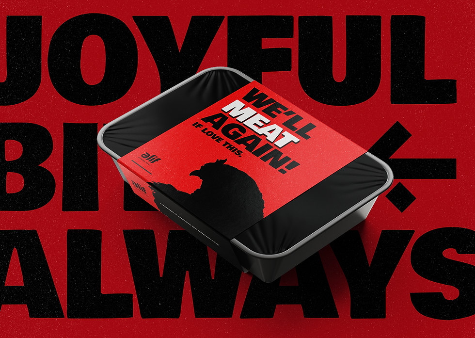
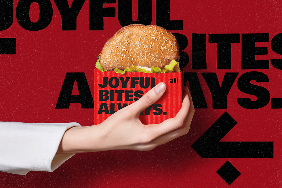
It moved across packaging, pizza boxes, burger wraps, chicken buckets, menus, posters, social, environmental graphics, digital and the website — from something held in one hand to something covering an entire wall.
The objective wasn't to make every application look identical. It was to create enough flexibility for each one to do its job while preserving the visual codes that made the brand recognisable.
Not uniform. Coherent.
Packaging, menus, marketing and digital weren't treated as separate applications. They were different expressions of the same visual language.
The format could change. The brand shouldn't.

The Outcome


One identity. Four addresses.
Alif was designed with growth in mind — an identity that could move from one restaurant to the next without losing the familiarity it had begun to build.
As the business expanded to four outlets, the brand travelled with it.
New spaces and new applications became extensions of the same visual world rather than reasons to start again.
The footprint got bigger.
The identity stayed unmistakably Alif.
SUCCESS STORIES
Don't just take our word for it. That'll be terrible due diligence!
BrandBench transformed our vision into a clear and professional brand identity. We had a very difficult task and approached many designers, but it was Alok who truly listened, understood our market, and delivered amazing branding! Their creativity, attention to detail, and reliability made the whole process seamless and we believe strong branding is the first step towards success.
Shoeb S.
Founder - Alif
SUCCESS STORIES
Don't take our word for it. That'll be terrible due diligence!
What started as a logo project quickly grew into a much broader creative partnership. Alok understood the ambition behind Numera and built an identity that gave us a strong foundation as the business evolved.
M. Yerram
Marketing Lead, Numera Finance
PUT IT ON THE BENCH
Ideas are welcome. Problems too.
Get in touch
bottom of page