

Numera Finance
BRAND IDENTITY · VISUAL SYSTEM · ONGOING CREATIVE
Building the identity behind a financial brand now serving 10,000+ clients.
Numera began with an ambition to make world-class finance and accounting expertise more accessible. It needed an identity that could make that ambition recognisable — credible enough for finance, but approachable enough for the businesses it wanted to serve.
The answer began with two forms hiding in plain sight: the N of Numera and π.
What started as a logo brief grew into an ongoing creative relationship. Numera has grown considerably since then, with its platform serves 10,000+ clients across the US.


The Thinking
Two ideas. One mark.
The brief sounded simple: create a symbol that felt unmistakably Numera.
The name gave us the N. The world of numbers gave us π.
The opportunity was in finding the point where the two could become one — not simply combining two shapes, but creating a mark where one could suggest the other without compromising clarity or recognition.
It became an exercise in semiotics and reduction: using a familiar mathematical form to give the identity another layer of meaning, without asking the audience to work too hard to find it.
Two references. One symbol. Ideally, zero explaining.
Interestingly, π remains central to how Numera describes its identity today, using the symbol to represent ideas including universality, cycles and the relationship between precision and possibility.



The Identity
Finding the idea was one thing. Making it feel inevitable was another.
More than 25 explorations tested the relationship between N and π.
Move too far in one direction and the N became difficult to read.
Move too far in the other and the mathematical reference became little more than decoration.
So we kept reducing.
Proportion. Form. Balance. Recognition.
Until the two ideas stopped competing and started behaving like a single mark.
The wider identity followed the same principle of restraint. Blue and neighbouring tones created a visual language built around trust, clarity and approachability — qualities particularly important for a brand asking businesses to trust it with their finances.
Simple wasn't the starting point. It was the result.
The Making
From a mark to a visual language.
The identity was never meant to live inside a logo file.
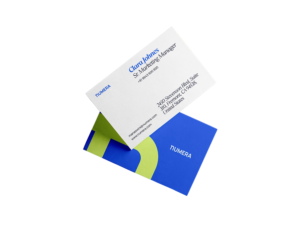
The symbol, colour and supporting visual language moved across collateral, communication, merchandise and eventually Numera's physical workspace — giving the brand a consistent presence wherever people encountered it.
As the applications changed, the principle stayed the same: recognisable without being repetitive, flexible without losing character.
And the engagement evolved too.
What began as a logo assignment developed into ongoing creative support — taking the relationship from defining how Numera looked to helping the brand continue to show up consistently as the business evolved.
One brief became a system.
One project became a partnership.


The business kept growing. The identity had room to grow with it.
Numera today is considerably larger than the business the original identity was created for.
It has evolved into a connected finance and accounting platform spanning specialized practices across accounting, tax and strategic advisory. Numera currently says its platform serves 10,000+ clients, with teams operating across the United States, Canada, India and the Philippines.
We wouldn't claim the identity created that growth.
But there is something satisfying about seeing a mark designed around N + π at the beginning continue to represent Numera at a very different scale.
The business became bigger.
The idea at its centre stayed remarkably simple.
The Outcome


SUCCESS STORIES
Don't just take our word for it. That'll be terrible due diligence!
BrandBench transformed our vision into a clear and professional brand identity. We had a very difficult task and approached many designers, but it was Alok who truly listened, understood our market, and delivered amazing branding! Their creativity, attention to detail, and reliability made the whole process seamless and we believe strong branding is the first step towards success.
Shoeb S.
Founder - Alif
SUCCESS STORIES
Don't take our word for it. That'll be terrible due diligence!
What started as a logo project quickly grew into a much broader creative partnership. Alok understood the ambition behind Numera and built an identity that gave us a strong foundation as the business evolved.
M. Yerram
Marketing Lead, Numera Finance
PUT IT ON THE BENCH
Ideas are welcome. Problems too.
Get in touch